 Why can choosing paint colours for your room become such a stressful task? Is it because we get overwhelmed with hundreds of paint variations, is it the anxiety of choosing the wrong colour, or is it because we just think about it too much instead of going with our first instinct?
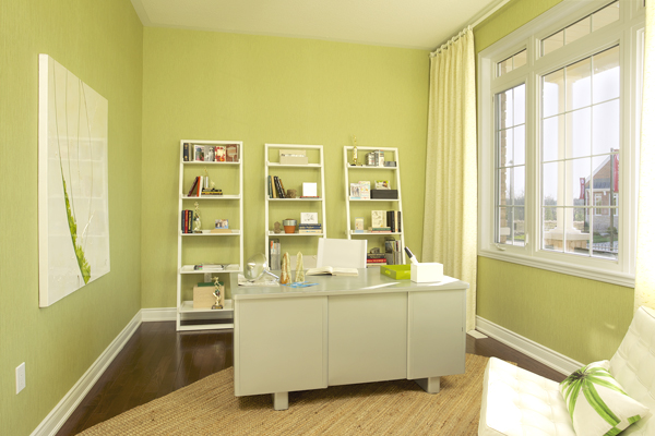
Well it’s time to relax and remember; choosing colours for your room should be fun! My inspiration came from the colours Geranium Homes used in the library of this Village at Sally Creek Model Home (shown above,) and I really wanted to find out how to pick colours that really made me say wow. So I asked some Colour Consultants at various paint stores for a few tips on how to make this a less painful endeavour.
Inspirations
Karen, at Sherwin-Williams explained that the first step is to look in magazines for inspiration and to get an idea of what you want. “But be sure to choose colours that YOU like, don’t just go by what the trends are – at the end of the day you’re the one who’s living with this colour,” she warns.
The neatest advice I found (from HGTV) was to look at your wardrobe. We tend to buy clothes in the colours we look best in, so we should do the same with our walls. “If you don’t wear yellow, don’t get a yellow sofa. You’re going to look sickly on it.”
Mood
Once you have a basic idea of what you want you need to consider the mood of the room – Soothing or intimate, formal or social? A little colour psychology will definitely help you create the right mood.
Soothing soft cool colours and neutrals create a quieter ambiance, while the deeper blue, greens and grays give a more formal impression and brighter hues work for a more social environment. But be careful when using bright yellows and reds as they dilate pupils and increase blood pressure, so make sure you don’t over stimulate kids rooms.
Lighting
It’s also a good idea to pay attention to the kind of lighting in the room, is there a lot of natural daylight? Direct or indirect light can change the feel of the colour. Incandescent lighting brings out the warmer tones while fluorescent lighting often casts a blue tone. So be patient and look at your colour choice throughout the day and night to see how it changes. When I did this, I found my gray paint looked too brown, and had to start the selection all over again.
60-30-10 Rule
Have you heard of the 60-30-10 Rule? Neither had I until I started asking the Colour Experts, but it makes sense.
The primary colour should cover about 60% of the space and the overall theme of the design. 30% of the secondary colour to create contrast (this would most likely be your furniture.) The final 10% would be the accent colour such as throw pillows and accent pieces.
The Bottom Line?
Don’t sweat it. Colour is very personal, it’s your signature, so follow your instincts and show your personal style. If you like it, then don’t be afraid to go for it.


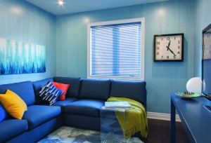
Love the suggestions and the new blog! The blue media room really makes me want to repaint my den.
Thanks Anna, glad you like what you see!
I would definitely go with #2. The first one (brown) looks off becuase you don’t have any of those tones anywhere except in the shingles, which are lighter anyway. #2 brings out the mortar color in the stone you have on the front. I’m new to your blog, and you might have already covered this, but have you thought about an actual pop of color for your door? Nothing too wild (neighbors) but something that actually draws attention to your front door rather than making it blend in with the rest of the house?The yellowish light coming through your garage door windows made me think that a nice *mellow* yellow door would be really nice against the gray, but I realize that’s pretty daring. Maybe a rust/brick red? Or even a really deep (almost gray) plum color? Just an idea. 🙂
hey. you have a pretty good post there mate.
Thanks!